Monday, 12 October 2015

Print advert evaluation

https://s-media-cache-ak0.pinimg.com/originals/4e/7e/5f/4e7e5fe9dae4663f94e7a11be2afa507.jpg
 I like this poster because it has movemet the lettering is facing in the same direction as the mans hand and the imediate attention to the FOLLOW ME! which i am going to use in my poster. Im also going to have my lettering thick and bold and i will get my lettering from dafont.com
http://static.wixstatic.com/media/362033_308e5dae2dfdb63dfca7c00c43dc31d3.png_srz_957_884_85_22_0.50_1.20_0.00_png_srz


http://www.dafont.com/irresponsible-direction.font?text=now%21&psize=l&back=new\
got my lettering from here

http://g03.a.alicdn.com/kf/HTB1LrLoIpXXXXcWXFXXq6xXFXXX6/Custom-table-font-b-flag-b-font-font-b-pole-b-font-for-sale.jpg

http://alsrodeo.co.uk/images/testimonials/army.png

http://www.furman.edu/academics/MilitaryScience/leadership/Documents/Leadership%20Excellence%20logo.gif


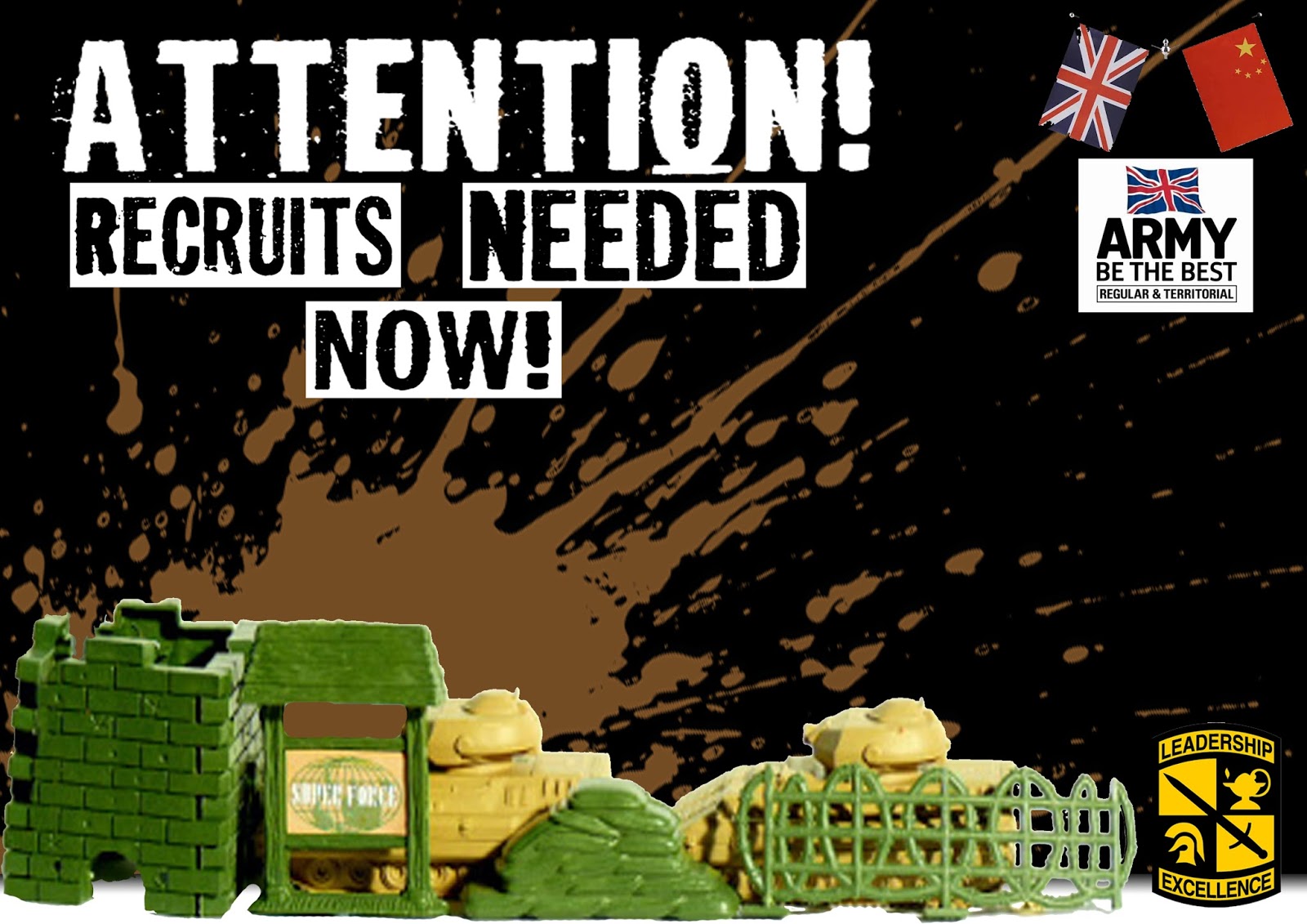
Well i did this unique print advert with a few simple images from the internet and an primary image of mine which was the army tanks and building and barb wiring. So i got a thought in  my head that this would be great for an recruitment advert to bring in more volunteers to be troops. so i did i wanted to create a bold and eye catching advert that would grasp your eyes attention at first glance and an easy way to start off was to have huge demanding lettering almost shouting at you "ATTENTION!" which also relates to army language. Also to make my lettering stand out even more i added a black background to make the lettering stand even more out because the aim of my advert is to attract attention because that is what the priority is for a advert.

What would i do if i was to do this again?
I would take better images of the props and also get better props. Also i would have tried to get my own dirt mark from taking and image of possibly brown paint splashed across paper then i could place it on my work and erase the background with he magic eraser. Also i could have drawn and scanned my drawings in of my own army logo and create my own flag and make this a lot more original.

I am happy with what i have come out with because it does what i wanted it to do and that was grab attention and i accoplished that with the bold text and the use of colours that stand out on the dark background.

Libary Introduction

Firstly the libary is on D floor and has 3 sections and colored and non colored printers (CMFD and MFD) in the center there is a reception for signing books to take them home. on the left side is a row of book shelves packed with book from educational to fantasy. There are computers and an CMFD printer on the left side. The right side has yet more computers but less books than the left and in here is an MFD printer. You can access the libary at any time during open hours so you can study as much a you want in a quite area.

Friday, 9 October 2015

Tempo How fast it is
Key The range if notes used in this song
Major Keys Tend to sound happy
Minor Keys Tend to sound sad
Diegetic Sound. Voices of the character
Non Diegetic Narraters.


Car Advert
https://www.youtube.com/watch?v=E1ceAFeT-7s

as the car is letting out the other car like its giving birth the tempo of the music increases and and the notes become higher. It goes from a minor key being sad at first to being happy by using major keys. There are also loud car noises in the background to make it sound more dramatic and intense.


sofa advert
https://www.youtube.com/watch?v=l4A4rKYR8qI

it has a moderate tempo and has a touch of relaxation to it as the women puts her feet up and it had a consistent tempo witht the use of minor and major keys.


Makeup advert
https://www.youtube.com/watch?v=y-HCU1wogpY

It has a kinda vintage feel with the slow music almost as if its trying to be sexy. The music also start to build up more and more as the women walks out into the crowd.


ADS i like:

Lloyds Bank
https://www.youtube.com/watch?v=f6eZ3WQCjhA

I like the suttle tempo and how the music is sad but cheerful at the same time as it links with the banks logo of a horse they also have the music relating to the horse in the background. they also have an non diegetic sound in the back with guy narrating over the video. It has a heart warming feeling to it as the video plays.


Tennis advert
https://www.youtube.com/watch?v=-rMrkyMn-sY

I like the music because its sharp and basic and also catchy. It also has an non diegetic sound as a women narrates over the advert. It gets dramatic as the guy hits the ball the music beat drops as he hits the ball.


5 freaky images
http://33.media.tumblr.com/a820593cfeee0cee4365748e4cbdb60a/tumblr_inline_n8q61fICFm1rmstfj.jpg


http://wac.450f.edgecastcdn.net/80450F/mix108.com/files/2012/02/61nqjVxWLdL.jpg


http://www.popgadgets.com/clothes/horsehead3.jpg


http://ecx.images-amazon.com/images/I/51DKaKIRBsL.jpg

4 primary images i took and one merged

i liked the setup for this because it has depth because i have placed the tanks in the background. i also like how ive set up the props putting them together creating a scene 

this was a terrible shot it was out of focus, small and also not centered. also i captured the whole shadow on the left which certainly if i would do this again i would make sure that i would check or these basic errors but for this one i didn't because i wasn't the one taking the shot but if i was i would have took more care into this shot. 

 This one as you see is alot better than the previous one because its in focus but yet again annoyingly i have the shadow still in the corner which has mostly ruined a lot of my shots. the placement is better than the last because you can see the extra little detail in the shot. 

i had trouble with merging the two images because i had such little time. but you can probably see on the right i have added another tank but edited the curves and levels of the tank but i didn't like this project because i was confused with the two projects i was doing colliding together.  Also what i would have done with more time is crop off the triangle in the corner of my picture. Its annoys me because i couldnt do this to the best of my ability. 


Wednesday, 7 October 2015

Ghostly Images - Opacity


http://www.lovethesepics.com/wp-content/uploads/2013/10/Spooky-Waverly-Hills-corridor.jpg


http://www.wallpapermay.com/thumbnails/detail/20120604/boots%20women%20emma%20watson%20black%20dress%20white%20background%201680x1050%20wallpaper_www.wallpapermay.com_29.jpg


http://static01.nyt.com/images/2012/11/11/magazine/11talk/mag-11Talk-t_CA0-superJumbo.jpg


try and see the 2 ghosts i have added and edited using the opacity tool.
https://c1.staticflickr.com/5/4144/4993435247_2e363b00b2.jpg

http://2012.csmwomenswear.com/wp-content/uploads/2012/06/swu.png


http://farm5.static.flickr.com/4033/4321200086_dd75c745b1.jpg


http://previews.123rf.com/images/rido/rido1112/rido111200030/11742881-Happy-smiling-young-man-leaning-against-white-wall-with-dreaming-and-pensive-expression-copy-space-o-Stock-Photo.jpg


i was able to easily create these from pasting and changing the opacity and also the hue and saturation.


Here is one i did myself with a camera by changing the shutter speed so the figure looks more blurred and ghostly.

Monday, 5 October 2015

Making the logo

http://cliparts.co/cliparts/Bia/E5K/BiaE5KLMT.jpg


http://me-trend.com/wp-content/uploads/2015/07/man-in-suit-and-hat-silhouette-aitibkdk.png


http://www.dafont.com/butter-kings.font?text=Horse+Master+Suits&psize=l


http://harboarts.com/artwork/bow-tie-vector-clipart_1343905679970/

Bow tie - Vector Graphics


Final Product


How did i create my logo?

Well from the images above i was able to create this by adding and re sizing the images and also using the invert tool in the "Image" Then "Adjustments" to swap the colors around such as black an white to white to black. I then went for a stylish text to set a professional standard onto the logo. also to get rid off the background i simply just used the magic eraser tool. The reason my image isnt large is because once this is printed on A4 my image will be larger then needed too.